
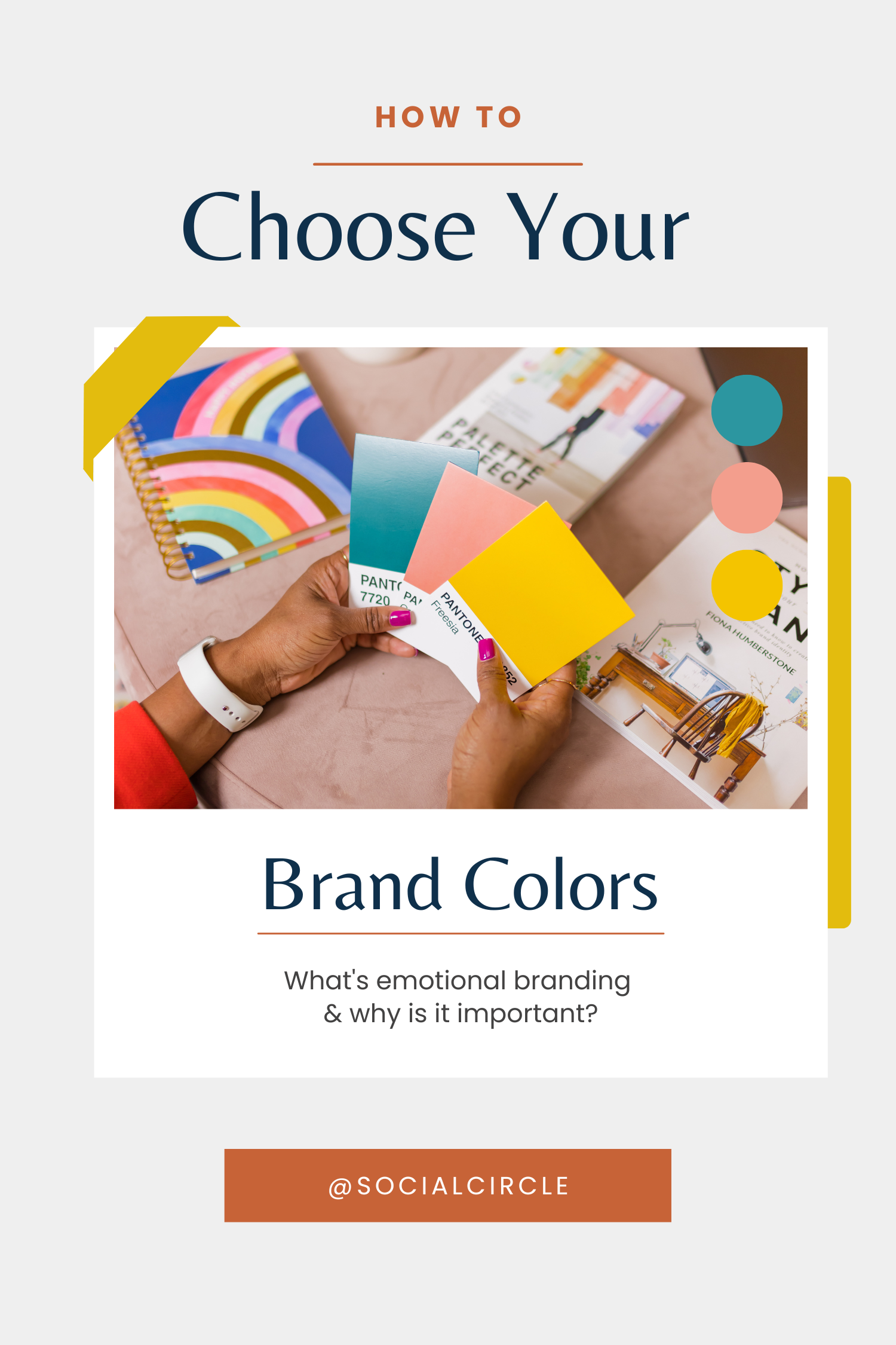
One of the most underrated areas of your brand is the colors you choose to represent the work you do. It’s no secret that building a business and visual identity can take a lot of work. Brand color palettes are essential tools for establishing a cohesive visual identity across all brand materials. These carefully chosen color sets reflect brand identities and influence consumer perception. When it comes to picking colors, it can feel like you’re falling into a whole new world with a different language and rules. But we’re here to rescue and guide you through the world of brand colors with a simple glossary of terms, and an introduction to emotional branding.
BRAND COLOR PALETTE GLOSSARY
First things first, we need to make sure we’re on the same page on this brand discovery journey. We want to make it as easy as possible for you to be confident in your color choices, and that means knowing exactly what we’re talking about! These are some common words and what they’ll mean for you…
- Brand colors – a predetermined set of colors that you use in your visual identity to increase your brand recognition, create consistent content, and show up professionally in front of your audience. You could also call this your color palette!
- Primary colors – when it comes to branding, we’re talking about more than just the primary colors on a color wheel. When it comes to your brand, we’re talking about the most popular colors you use most often, such as on your website, in your logo, and in your main marketing materials.
- Secondary colors – the secondary colors are typically the rest of the colors in your color palette. They compliment your primary colors and are typically the more unique, bright colors that are used to turn heads when you’re marketing your brand.
- Color psychology – this is the study of the impact certain colors have on your audience’s emotions and feelings. Emotional branding is the key to choosing a color palette that wins the hearts of your target audience.
- Brand personality – understanding a brand’s personality is essential for selecting effective brand colors. It involves identifying key personality traits that convey the brand’s unique identity and connect with customers on an emotional level.
- Brand personality traits – identifying these traits helps in choosing brand colors that align with consumer perceptions. Creating a list of adjectives that encapsulate the brand’s essence can guide the selection of colors that symbolize the brand’s values and appeal to its target audience.
- Color combinations – the strategic selection and flexibility in color pairings are crucial for branding. Different hues and pairings can convey various meanings and evoke specific emotions, making it important to understand color theory and experiment with diverse combinations.
Download our Brand Strategy Workbook
Building a brand strategy is not only extremely important but it’s also a lot of work, especially by yourself! To make this task more enjoyable (and successful) for you, we have created an in-depth and interactive brand strategy workbook that you can download right now!
WHAT’S EMOTIONAL BRANDING & WHY IS IT IMPORTANT FOR BRAND PERSONALITY?
Emotional branding is based on your brand strategy. Once you’ve gotten to know your ideal clients, you’ll know how they’re feeling before they interact with your brand. You’ll be able to identify the colors that will draw them to your brand and create the kind of environment that’s consistent with the experience you offer your clients. Understanding color theory can significantly enhance this process by helping you choose the right color combinations and contrasts to communicate your brand’s message effectively.
Complementary colors can enhance brand visibility and appeal by providing contrast and making elements like CTAs more eye-catching. Color psychology is the key to creating an emotionally on-brand color palette. Researching the feelings evoked by the colors you’re thinking of using in your brand will make sure that the colors you use are consistent with the content you create and the kind of business goals you’ve set.

For example, emotional branding helps a business decide whether a masculine or feminine color palette is better or whether a neutral, pastel or bright color palette is going to resonate best with your audience.
So what are the emotional qualities associated with some of the most common colors we see in our client’s brands?
- Black – black is often used in brands that want to be seen as powerful and luxurious. It’s typically seen as an elegant, high-end color that has a touch of mystery and aloofness. Black is the perfect color to add to your brand if you want to show up as a stylish expert! Black also makes a great accent color to draw attention to a certain area of your website or a social media post. You can also use it as a color for text on a bright or light-colored background.
- White – just like black, white, and similar light colors are super popular choices because of their versatility to be used as both a subtle background color and a great contrast on dark backgrounds. It also creates a clean atmosphere that makes people feel safe and gentle like they’re in the hands of people who have their best interests at heart. If your core values center around peace, integrity, trust, and similar beliefs, white would be the perfect color for your brand!
- Green – we tend to work with a lot of wellness professionals, and different shades of green are super popular choices since it’s associated with the natural world. Because of this, it’s also connected with health, healing, and freshness. This is why green is often seen as a calm, subdued color that helps people feel connected to the business they’re interested in working with. We’ll continue to recommend green, sage, and similar colors as a great choice for wellness brands!
- Pink – along with wellness brands, we typically work with women-owned brands that target a feminine audience. Pink is one of the first colors many of us think of when we think of a female-founded brand, so we continue to use it in our client’s brands!
It’s also a deeply personal color that makes people feel connected, sophisticated, compassionate, and sweet. - Beige – a great neutral option for many different niches is a beige color! Depending on the rest of your color palette, the beige you choose can contain hints of blues, greens, purples, pinks, and plenty of other colors for a cohesive look that can be used as a background or text color. As a neutral color, people tend to feel calm and relaxed when they see the color beige.
- Gray – just like beige, gray is a perfect in-between that you can use to fill out your color palette to look professional. It will help balance out the bright secondary colors you’ve chosen with your primary colors. Depending on the other colors in your palette, it can cool down a too-warm color palette or add a moody element to an already-cool color palette. Gray typically imparts intelligence, compromise, elegance, and a bit of mystery.

There’s much more to choosing a color palette than simply selecting 5-7 colors that look nice. We want to make sure the colors you choose align with your brand strategy and don’t limit you as you grow your business. Selecting successful brand colors is crucial as they can greatly influence customer perceptions and experiences.
As you’re picking out colors, remember to keep a good balance of lights and darks so that your colors work well on top of each other. You’ll also want to make sure there’s enough variation between colors so that it’s easy to read text and doesn’t strain the viewer’s eyes. If you want to read more about brand strategy and how to create an intentional brand, click here!
Related Article: How to Choose the Right Fonts for Your Brand
FAQ’s
Why does color matter in branding?
Color is a potent tool in branding. It evokes emotions, builds recognition, and reflects a brand’s personality. Beyond aesthetics, color influences consumer behavior and purchasing decisions. Understanding cultural color connotations is essential for effective global branding.
How many colors are good for branding?
Less is more when it comes to color in branding and 3-5 brand colors is an ideal choice. A strong primary color with one or two accents is typically optimal. Overusing colors can dilute your brand’s impact.


")
